align-items property
The align-items property specifies
elements alignment along the cross axis for
flex blocks and along the vertical axis for
grids. It applies to parent element.
Syntax
selector {
	align-items: flex-start | flex-end | center | baseline | stretch;
}
Values
| Value | Description |
|---|---|
flex-start |
Blocks are pressed to the start of the cross (vertical) axis. |
flex-end |
Blocks are pressed to the end of the cross (vertical) axis. |
center |
Blocks are centered on the cross (vertical) axis. |
baseline |
Elements are aligned to their baseline. The
baseline (or font line) is an imaginary line
running along the bottom edge of the
characters without taking into account
overhangs, for example, like the
'p', 'q', 'y', 'g'
letters.
|
stretch |
Blocks are stretched to take up all the
available space along the cross axis, while
still taking into account min-width
and max-width, if specified. If the
width and height for the elements are
specified, stretch will be ignored.
|
Default value: stretch.
Example . The stretch value
Now the main axis is directed from left to right, and along the cross axis the elements are stretched to their full height:
<div id="parent">
	<div>1</div>
	<div>2</div>
	<div>3</div>
	<div>4</div>
	<div>5</div>
</div>
#parent {
	display: flex;
	align-items: stretch;
	flex-direction: row;
	border: 1px solid #696989;
}
#parent > div {
	border: 1px solid #696989;
}
:
Example . The stretch value + element dimensions
The elements are currently given width
and height, so the stretch value
for the align-items property
will be ignored:
<div id="parent">
	<div>1</div>
	<div>2</div>
	<div>3</div>
	<div>4</div>
	<div>5</div>
</div>
#parent {
	display: flex;
	align-items: stretch;
	flex-direction: row;
	border: 1px solid #696989;
}
#parent > div {
	width: 100px;
	height: 50px;
	border: 1px solid #696989;
}
:
Example . The flex-start value without element dimensions
Now the elements will be pressed to the top:
<div id="parent">
	<div>1</div>
	<div>2</div>
	<div>3</div>
	<div>4</div>
	<div>5</div>
</div>
#parent {
	display: flex;
	align-items: flex-start;
	flex-direction: row;
	border: 1px solid #696989;
}
#parent > div {
	border: 1px solid #696989;
}
:
Example . The flex-start value + element dimensions
Now the elements will still be pressed to the top, but they will have the specified width and height:
<div id="parent">
	<div>1</div>
	<div>2</div>
	<div>3</div>
	<div>4</div>
	<div>5</div>
</div>
#parent {
	display: flex;
	align-items: flex-start;
	flex-direction: row;
	border: 1px solid #696989;
}
#parent > div {
	width: 100px;
	height: 50px;
	border: 1px solid #696989;
}
:
Example . The flex-end value + element dimensions
Now the elements will be pressed to the bottom:
<div id="parent">
	<div>1</div>
	<div>2</div>
	<div>3</div>
	<div>4</div>
	<div>5</div>
</div>
#parent {
	display: flex;
	align-items: flex-end;
	flex-direction: row;
	border: 1px solid #696989;
}
#parent > div {
	width: 100px;
	height: 50px;
	border: 1px solid #696989;
}
:
Example . The center value + element dimensions
Now the elements will be centered along the cross axis (in this case, vertically):
<div id="parent">
	<div>1</div>
	<div>2</div>
	<div>3</div>
	<div>4</div>
	<div>5</div>
</div>
#parent {
	display: flex;
	align-items: center;
	flex-direction: row;
	border: 1px solid #696989;
}
#parent > div {
	width: 100px;
	height: 50px;
	border: 1px solid #696989;
}
:
Example . The center value, elements of various sizes
Now the elements have different sizes in
height (now they are separated by text,
but you can also set height),
all have the same width, since the
width property is set:
<div id="parent">
	<div>1</div>
	<div>2</div>
	<div>3</div>
	<div>4</div>
	<div>5</div>
</div>
#parent {
	display: flex;
	align-items: center;
	flex-direction: row;
	border: 1px solid #696989;
}
#parent > div {
	width: 100px;
	border: 1px solid #696989;
}
:
Example . The baseline value, elements of various sizes
This is how alignment to the baseline looks like:
<div id="parent">
	<div>1</div>
	<div>2</div>
	<div>3</div>
	<div>4</div>
	<div>5</div>
</div>
#parent {
	display: flex;
	align-items: baseline;
	flex-direction: row;
	border: 1px solid #696989;
}
#parent > div {
	width: 130px;
	line-height: 1;
	border: 1px solid #696989;
}
:
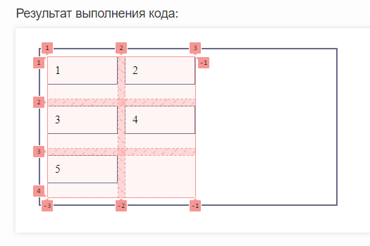
Example . Alignment to the start of the vertical axis in the grid
Let's align our elements inside the cells to the start of the vertical axis:
<div id="parent">
	<div>1</div>
	<div>2</div>
	<div>3</div>
	<div>4</div>
	<div>5</div>
</div>
#parent {
	display: grid;
	align-items: flex-start;
	grid-template-columns: 100px 100px;
	gap: 10px;
	padding: 10px;
	border: 2px solid #696989;
	height: 200px;
	width: 400px;
}
#parent > div {
	gap: 10px;
	padding: 10px;
	box-sizing: border-box;
	border: 1px solid #696989;
}
:
Now let's look at our grid in the browser debugger:
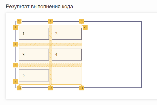
Example . Aligning to the center of the vertical axis in the grid
Now let’s align our elements in the cells along the center of the vertical axis:
<div id="parent">
	<div>1</div>
	<div>2</div>
	<div>3</div>
	<div>4</div>
	<div>5</div>
</div>
#parent {
	display: grid;
	align-items: center;
	grid-template-columns: 100px 100px;
	gap: 10px;
	padding: 10px;
	border: 2px solid #696989;
	height: 200px;
	width: 400px;
}
#parent > div {
	gap: 10px;
	padding: 10px;
	box-sizing: border-box;
	border: 1px solid #696989;
}
:
Let's look at the grid display in the debugger:
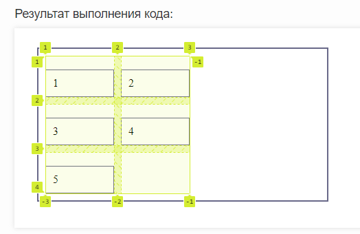
Example . Aligning to the end of the vertical axis in the grid
Let's change the alignment of the elements again, this time to the end of the vertical axis:
<div id="parent">
	<div id="elem1">1</div>
	<div>2</div>
	<div>3</div>
	<div>4</div>
	<div>5</div>
</div>
#parent {
	display: grid;
	align-items: end;
	grid-template-columns: 100px 100px;
	gap: 10px;
	padding: 10px;
	border: 2px solid #696989;
	height: 200px;
	width: 400px;
}
#parent > div {
	gap: 10px;
	padding: 10px;
	box-sizing: border-box;
	border: 1px solid #696989;
}
#elem1 {

}
:
Now let's see via the debugger what our grid looks like:
See also
-
the
flex-directionproperty
that specifies a direction of the flex block axes -
the
justify-contentproperty
that sets an alignment along the cross axis -
the
align-itemsproperty
that sets an alignment along the cross axis -
the
flex-wrapproperty
that sets the multi-line nature of flex blocks -
the
flex-flowproperty
a shorthand for flex-direction and flex-wrap -
the
orderproperty
that specifies an order of flex blocks -
the
align-selfproperty
that specifies an alignment of a single block -
the
flex-basisproperty
that sets a size of a certain flex block -
the
flex-growproperty
that sets a greediness of flex blocks -
the
flex-shrinkproperty
that sets a shrink of flex blocks -
the
flexproperty
a shorthand for flex-grow, flex-shrink and flex-basis